After eleven years without a change, Apple Music has a new visual identity. The lettering goes lowercase, the icon drops its trademark red, and the whole thing was shaped by an original composition by Fred again..
Since launching in 2015, Apple Music had barely touched its identity. Now it has. The service made its new look official on 21 October on its X account: “Introducing a new identity for Apple Music, physically shaped by an original composition”. The composition in question is by Fred again.., with the studio NEST Acoustics.
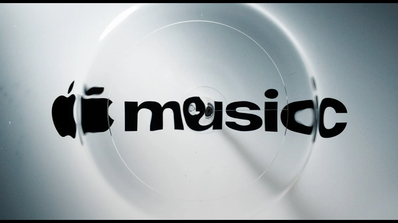
The new logo had already been spotted in late September around the Apple Music Hall, the service’s London venue, then in the iOS 27.2 and macOS 27.2 betas. The word “music” is now fully lowercase, in a much heavier weight. The most visible change is the icon: the red that had been with the app since day one is gone. In its place, a black note on a white background, which inverts in dark mode.
The launch video sets the tone: the logo warps on a black background, driven by the Fred again.. track, with coloured fringes around the edges of the letters. An identity built from the sound rather than laid on top of it, which makes sense for a music platform.
Reactions are mixed. Many like the new lettering but miss the red that had become inseparable from the service. Apple has not yet said when these changes will reach the public version of iOS.